← All work
FamilyBond
An app that helps older parents and their busy grown-up kids stay close — gentle colour, big type, zero confusion.
An app that helps older parents and their busy grown-up kids stay close — gentle colour, big type, zero confusion.
Many older parents live apart from their children and quietly struggle with apps built for someone else.
FamilyBond is a family app designed around their pace — one calm place for moods, photos, plans and small everyday check-ins.
Most family apps are designed for the kids. The parents are left to cope.
Pain points showed up on both sides: loneliness among parents living alone, children who rarely know how their parents really feel, and a steep learning curve with digital products.
Mapped needs on both sides of the family — isolation and tech anxiety for parents, guilt and time pressure for their children.
Large type, high-contrast controls and a warm yellow palette, with every key action kept within two taps.
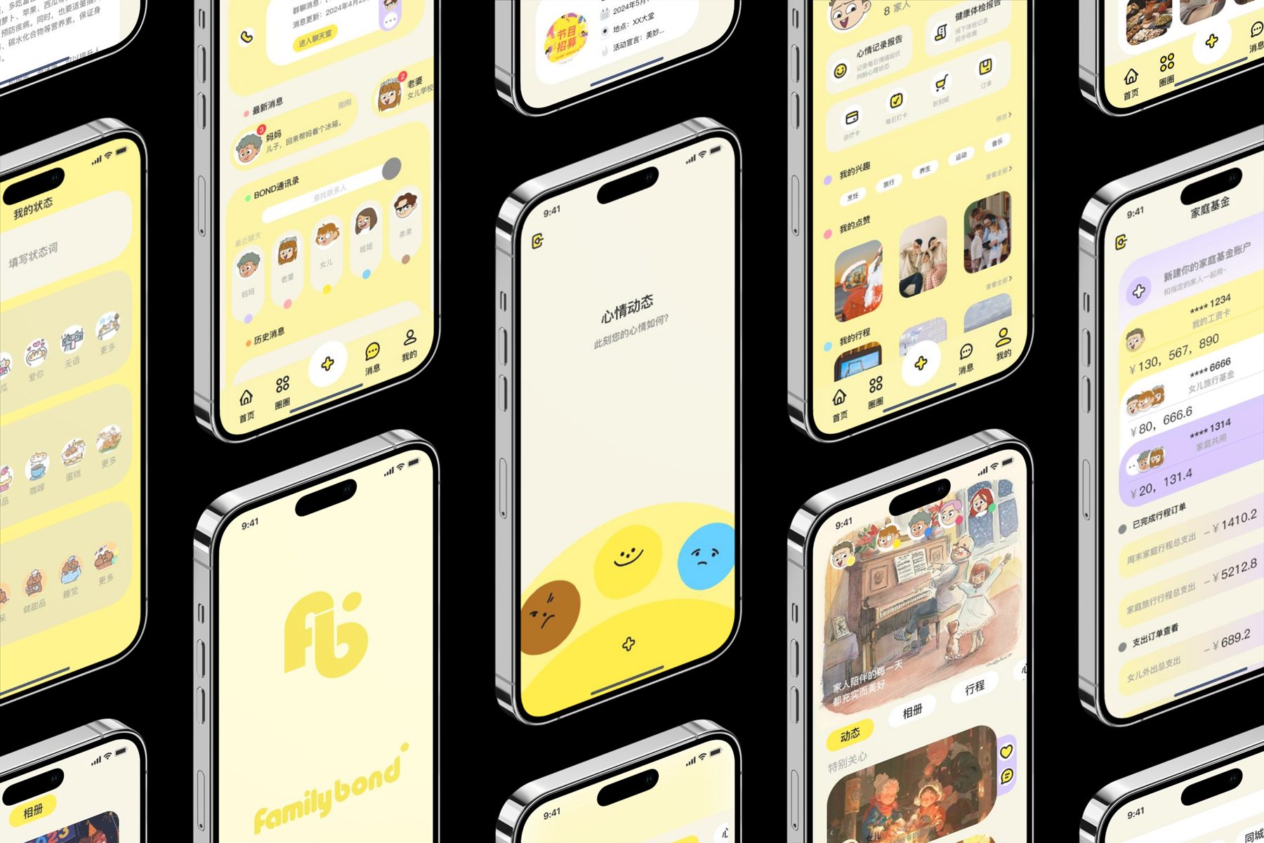
A one-tap mood check-in, a shared family album, activity plans and a family wallet, all from one home screen.
A single tap to share how you feel says more than a chat thread nobody answers.
Soft yellow and hand-drawn illustration — friendly without talking down to older users.
Anything that couldn't earn its place on the home screen was cut.
Designing for older users made every screen better for everyone: clearer labels, fewer choices, bigger targets.